Honda in America • Investment Map
How can we utilize new technology to show investment data in a fun and engaging way?
Summary
For more than 60 years, Honda has invested in its U.S. operations, created jobs, and contributed to the U.S. economy as a committed corporate citizen in America, and has shared that data annually. Up until the point of kicking off this project, Honda’s Government Relations office had always shared this information primarily as a pdf, with the information also being available on their website in a static format. This was information that was to be celebrated though, so they set out to modernize how they conveyed their U.S. investments through an interactive map.
Team Myself, senior developer, project manager
My Role UX research, UX design, front-end development

Discovery
Due to this being an agency project, the idea behind creating an interactive map was already established before project kickoff, so the questions within discovery revolved around what our capabilities were. Within the first week our teams came together to outline the data that needed to be presented, as well as defining the general experience we were hoping to accomplish at launch. Within this time 2 main areas of importance became clear:
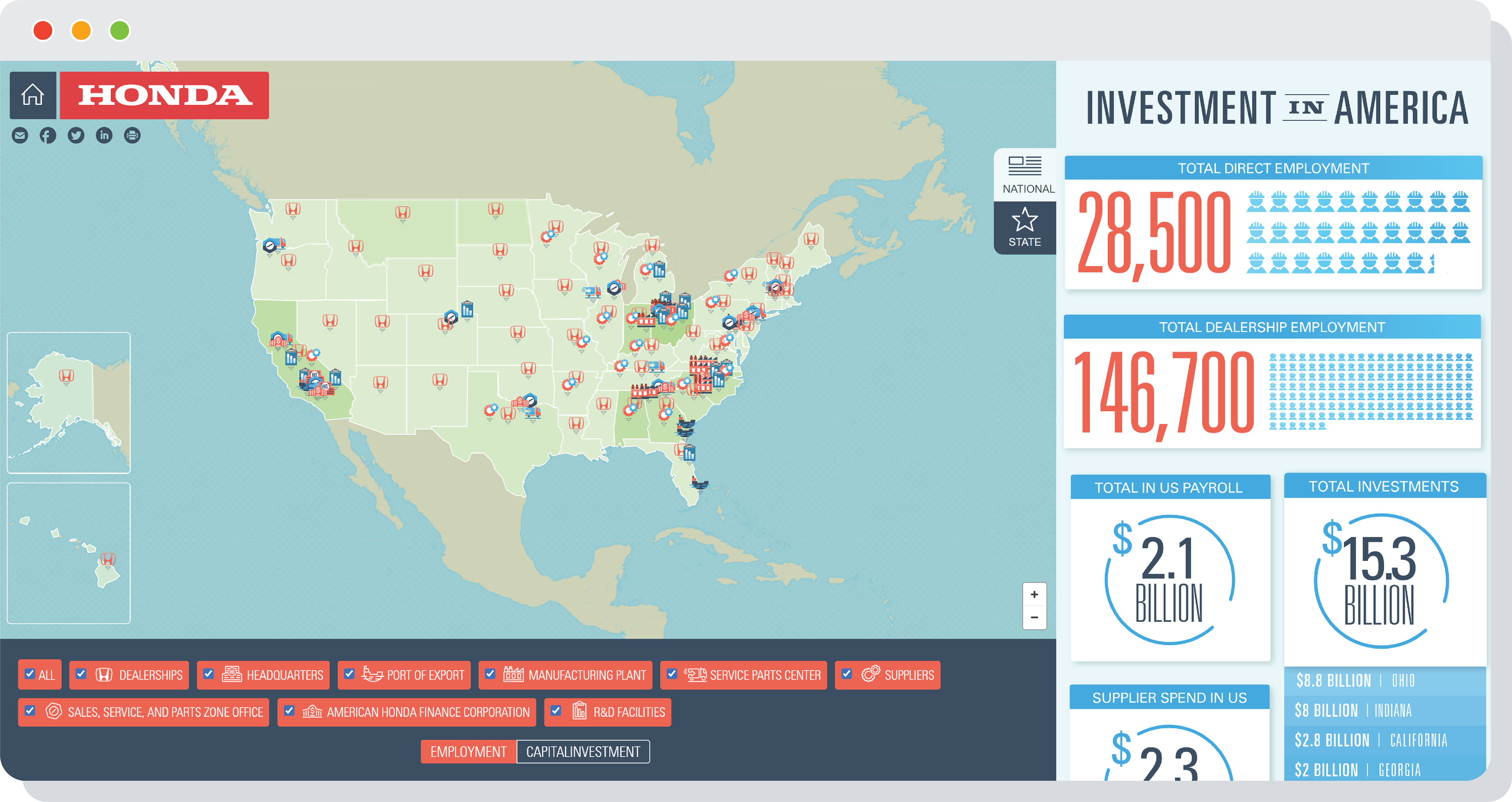
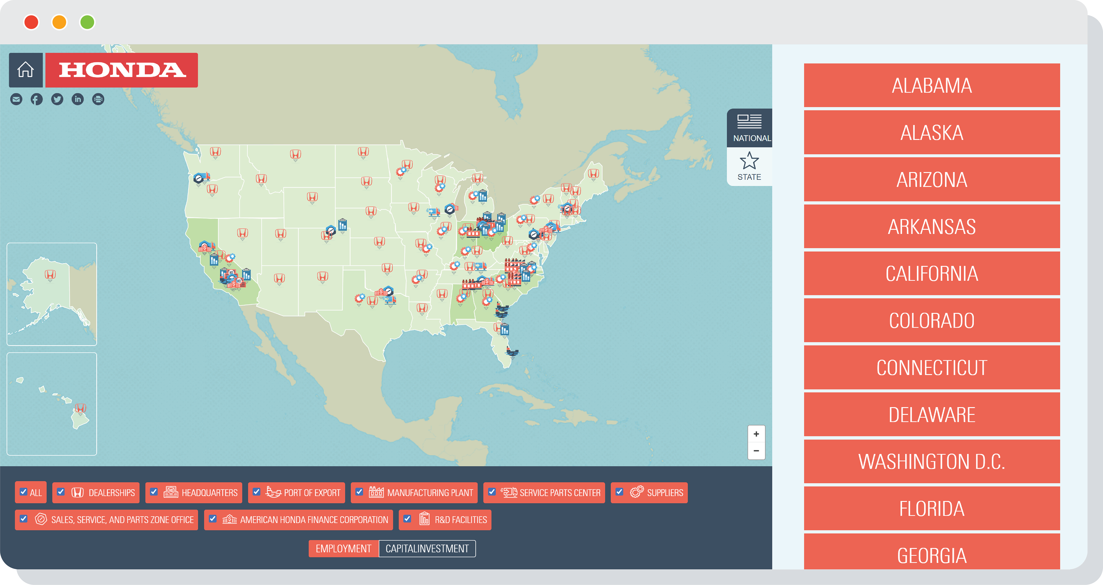
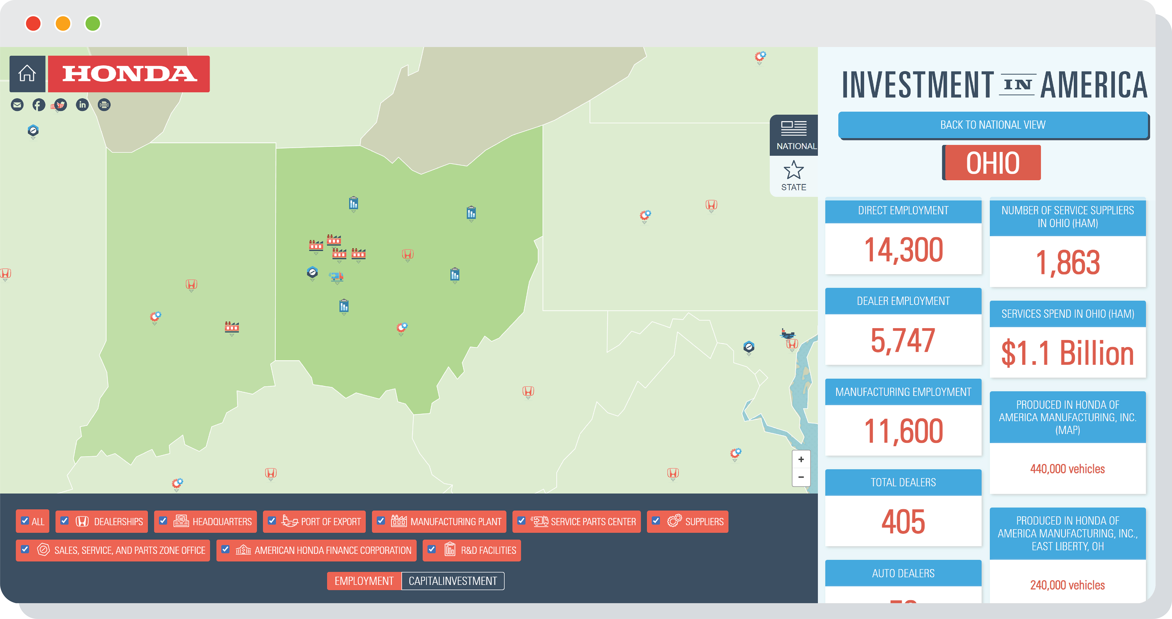
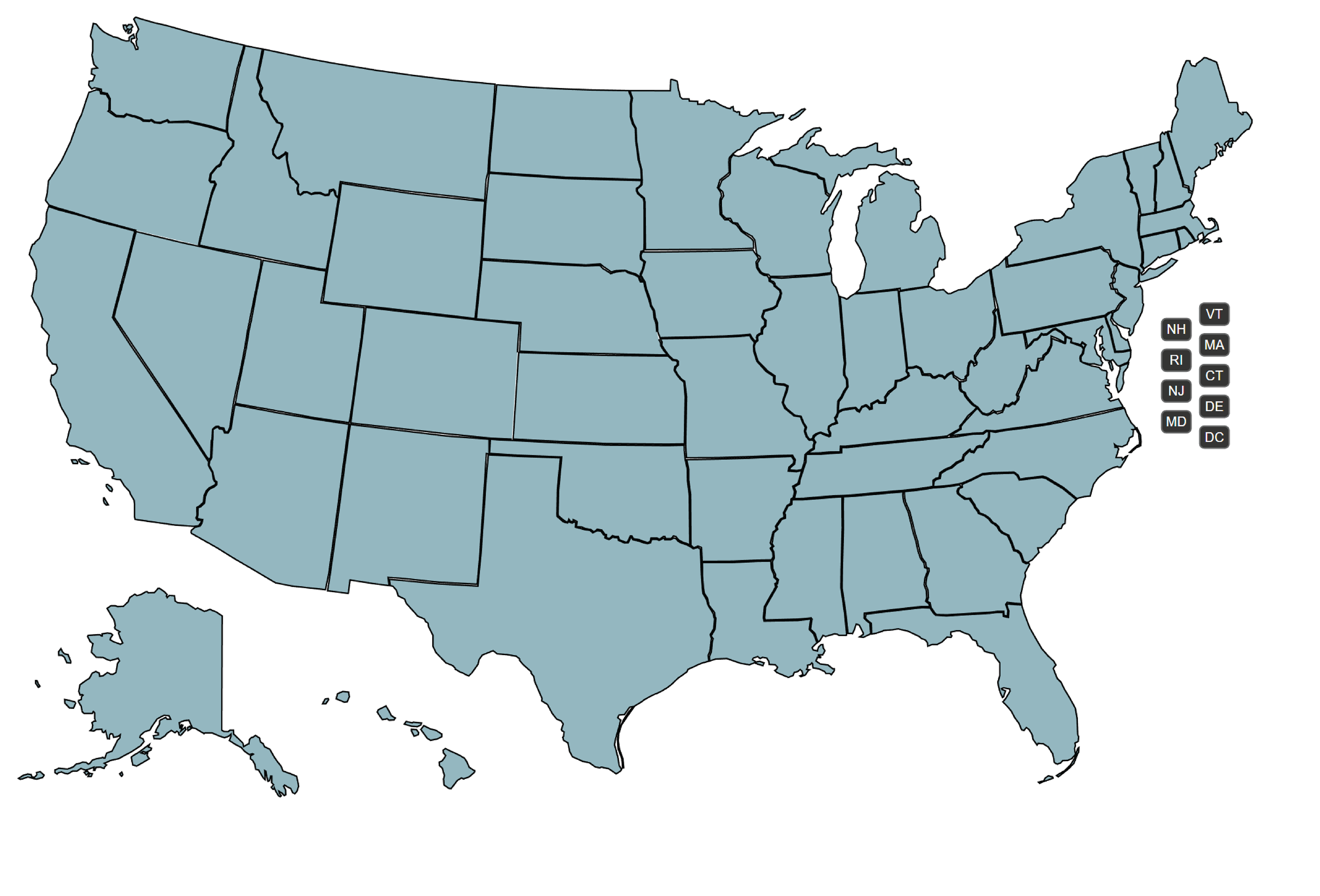
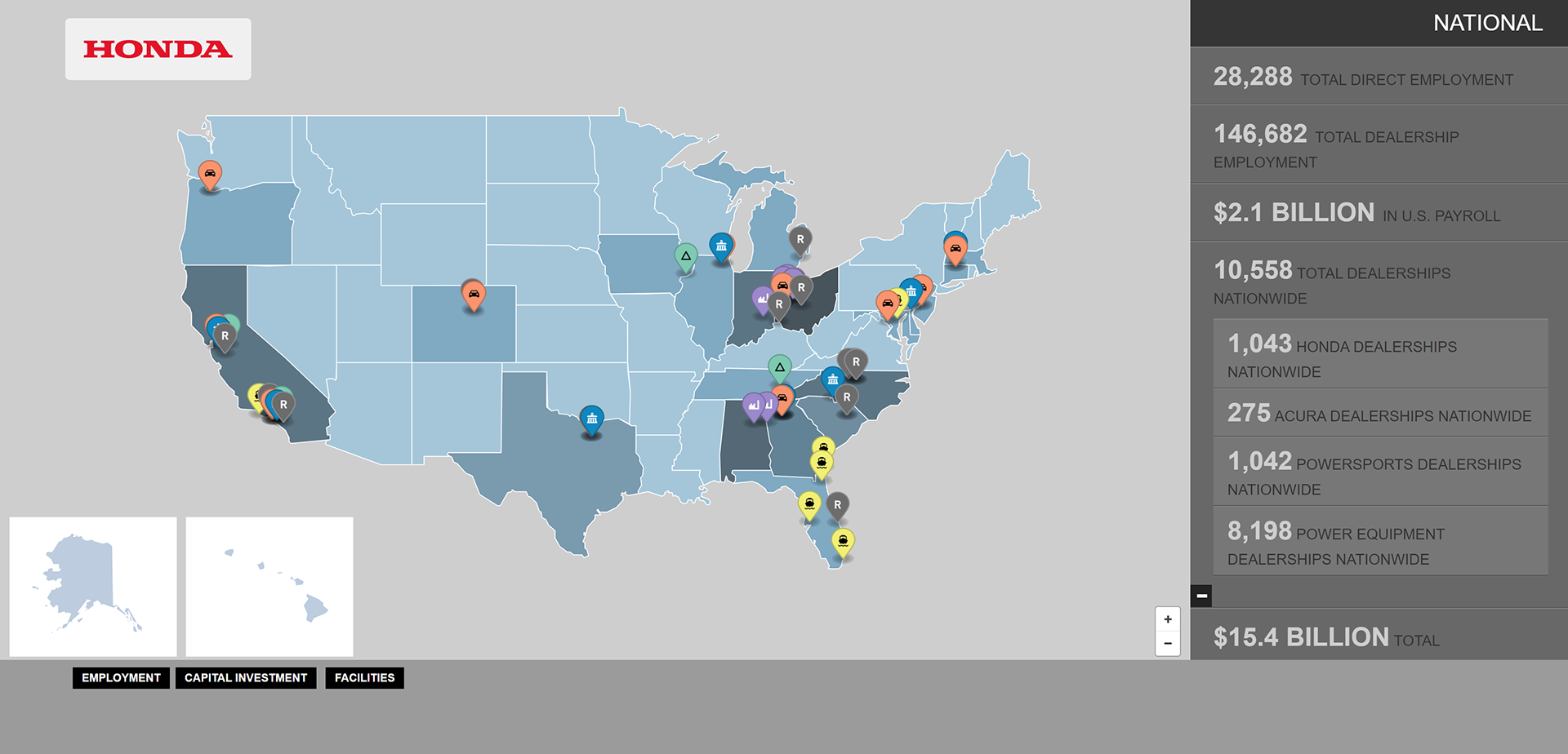
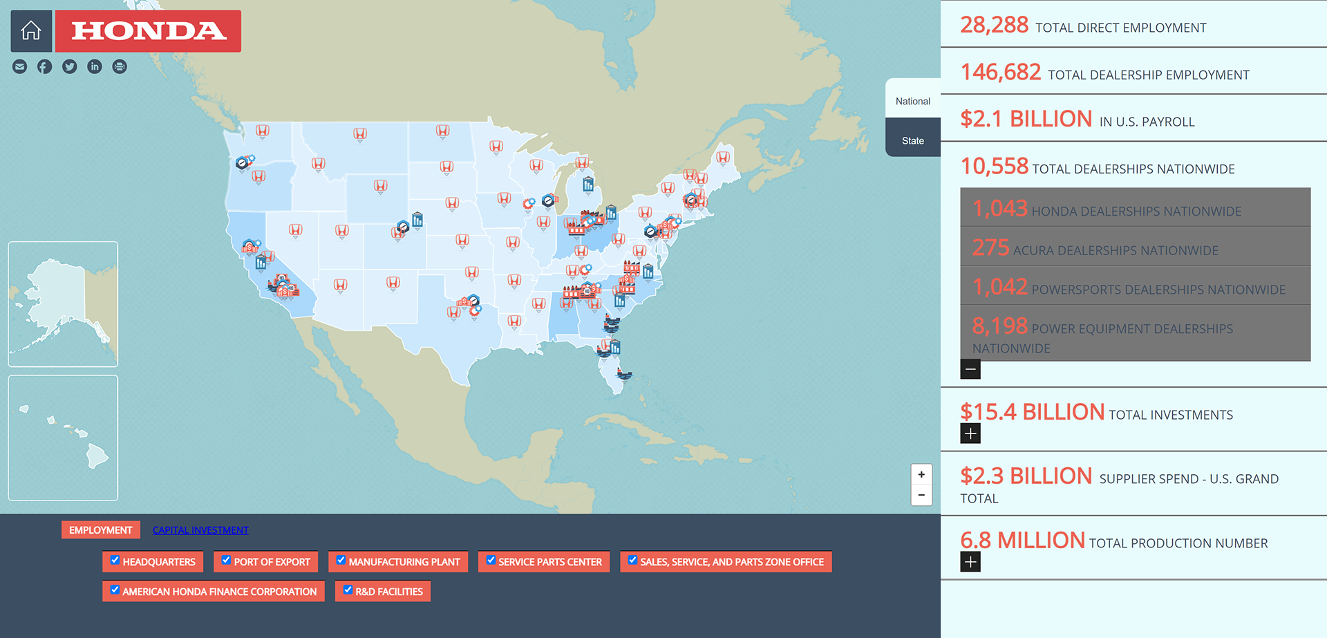
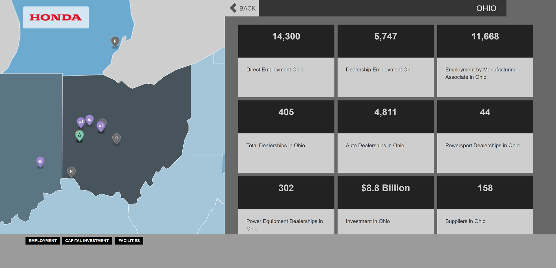
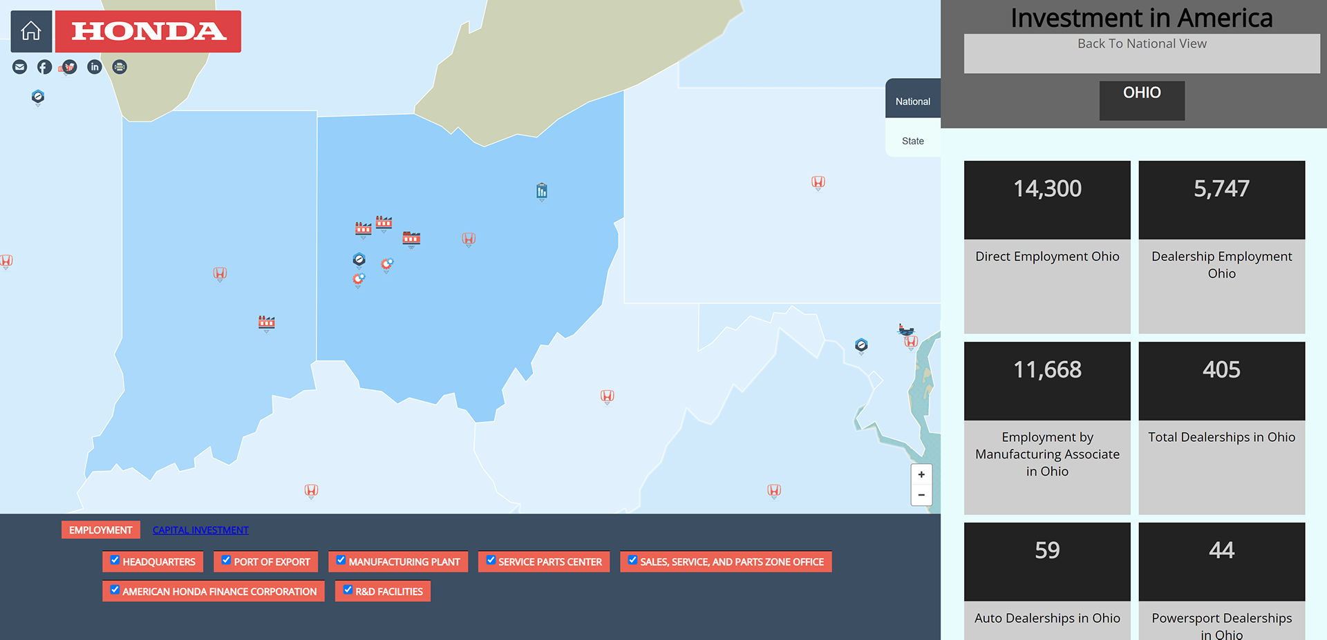
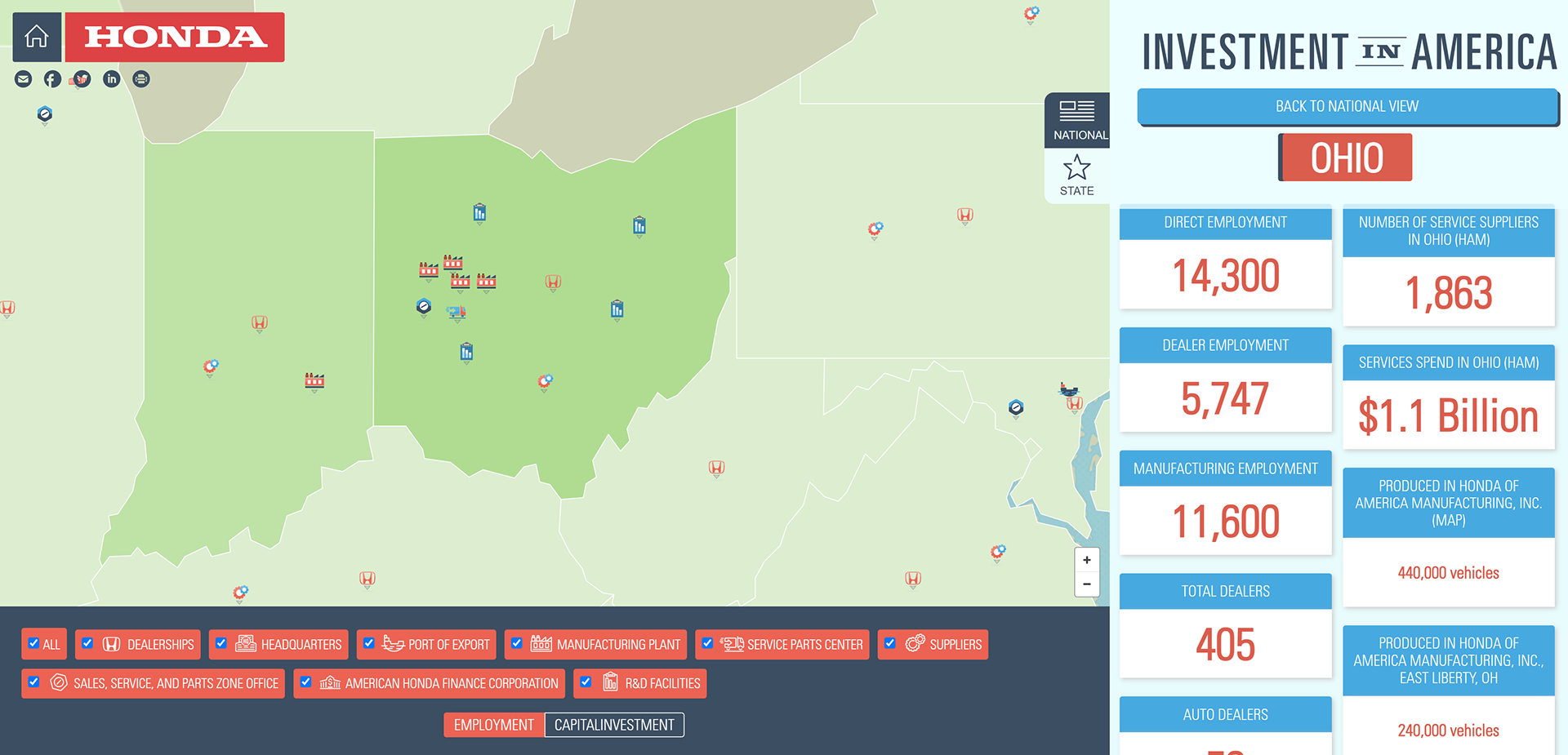
1•National vs state data. The data feeds that were provided outlined both investment data for the U.S. as a whole, as well as investments made in each state. A user would need to navigate to either effortlessly.
2•Branding is important, but so is the fun aspect. This was one of the most exciting elements of the project, that while our team was confined to some branding rules the objective of the end product was to be fun and engaging.
Brainstorming
One of my primary roles on this project was to lead the development of the project, so a lot of the brainstorming phase centered on finding my technical limitations. I began by researching as many potential mapping solutions as I could which included Google Maps, ArcGIS, and Mapbox. In the end I chose to use Mapbox as it was so flexible and the learning curve wasn’t too overwhelming for our deadline.
The other facet of discovery that was important to understand before jumping into building was the data. Honda’s team provided ours with 3 spreadsheets containing data around locations, capital investments, direct employment, manufacturing, production, and much more.
Build, Test, & Iterate
I approached this project by focusing on one aspect of the map and/or data at a time and thoroughly testing before moving on, paying almost no attention to aesthetic while building out functionality. I began with the national view and all of its functionality such as filters and heat map overlays before moving on to the state views.

As I worked on each aspect of the map I would test with the Honda team twice a week. This made for very quick iterations of collecting feedback, discovering bugs, and validating the direction of the project. This kind of quick cadence made for a close partnership where we were able to openly brainstorm on innovative ideas for the next phase of review.
Hifi & Branding
Once a large majority of the functionality was in place I was then able to focus almost exclusively on the visual design of the map. Honda provided print collateral from previous years and guidelines around branding, but otherwise our team was encouraged to experiment.

In the end we created an entire Honda specific icon set, a fun, textured map aesthetic, all tied together with a color palette to match their overall marketing direction.
Outcomes
While Honda in America has since moved to a more interactive website based approach to presenting their annual data, they did continue to maintain and use this interactive map for the following 5 years after launch. It was an incredible project to build my own knowledge around user experience design, visual design, and innovative development.